Vaisala — viewLinc 5
Enterprise environmental monitoring: redesigned information architecture and web front-end interactions for real-time alerts and regulatory-compliant data logging.
- Role: Senior UX Designer
- •
- Focus: IA, front-end interaction design, usability testing, GUI guidelines
Context
viewLinc provides continuous environmental monitoring across facilities and device fleets with audit trails, alarms, and reporting used in compliance-heavy domains (e.g., life sciences, food, museums). I translated usability findings from viewLinc 4.5 into a redesigned information architecture and interaction model for the upcoming 5.0 web front-end.
Objectives & Constraints
Project Objectives
- Clarify navigation and system hierarchy (sites, devices, probes, alarms).
- Improve alarm management (configuration, acknowledgement, and auditability).
- Produce GUI guidelines for consistent web application behaviour and styling.
Constraints
- Regulatory expectations (e.g., audit trails, access controls, record integrity).
- Global install base with internationalization and varied network environments.
- Backward-compatibility expectations from long-time users.
- Distributed collaboration with HQ UX team in Finland.
Process
Research to IA
- Analysed viewLinc 4.5 usage and support feedback to surface friction.
- Defined system information architecture and revised menu taxonomy.
- Mapped alarm and reporting jobs-to-be-done to task flows.
Prototyping & Testing
- Low/medium-fidelity prototypes (paper + interactive) for early validation.
- Usability studies using Userlytics and remote sessions with SMEs.
- Iterated interaction patterns for alarms, charts, and device detail views.
Guidelines & Handoff
- Authored web application GUI guidelines for consistent behaviours and styles.
- Aligned guidance with existing component libraries (e.g., Bootstrap/ExtJS patterns).
- Partnered with HQ UX to socialise guidance and support implementation.
Selected Highlights
Click an image thumbnail to open full size
image in a popup browser window.
Subsequent images will open in the same
popup window.
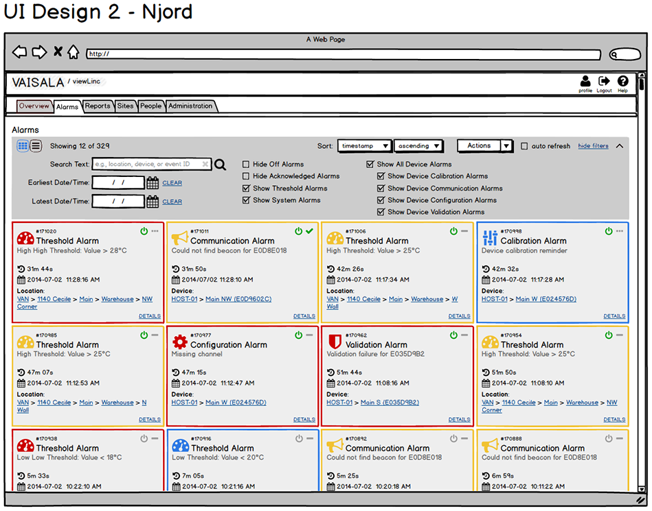
Initial UI Concepts
Developed and presented four different design options to choose from for the updated dashboard layout.


Site Manager Location Properties
Reorganized layout of location/zone display, switched site manager to a tab-based navigation, added icons and increased whitespace to improve usability and accessibility.


Zone & Location Hierarchy
Wireframe (Balsamiq): Reworked the display for zones and locations, adding icons, colour and font styles for quick status identification.


Outcomes & Reflections
Outcomes
- Clearer navigation and reduced configuration errors for alarms.
- Consistent GUI guidance adopted across web application modules.
- Improved efficiency around identifying alarm states.
Reflection
In regulated environments, confidence is usability. Traceable actions, predictable components, and clear task framing helped users respond and act faster while preserving auditability and data integrity.
Want to see more enterprise UX?
Explore additional case studies or get in touch for additional information.


